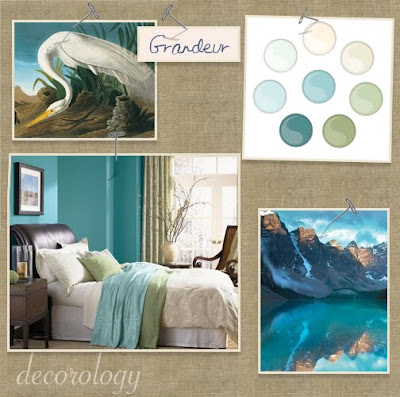
So, my weakness when it comes to design is color. I'm a bit afraid of it and always lean towards white or soft neutrals. I know, however, that I have to take baby steps to walk the path to using rich, bold colors - so here's a baby step.
These palettes were sent to me by Olympic, who introduced a line partnered with the Audubon Society to raise awareness of the natural world, and to emphasize the importance of environmentally-conscious painting.
Here are the palettes. I've lettered them and would really like to hear which one is your favorite!
A. Tranquil

B. Splendor

C. Mysterious

D. Majestic

E. Harmony

F. Grandeur

G. Glorious

H. Brilliance

If I had to choose I'd pick E. Harmony. How about you?


0 komentar:
Posting Komentar